Cody Haight
Head Paint Artist
PARLEE PAINT LAB
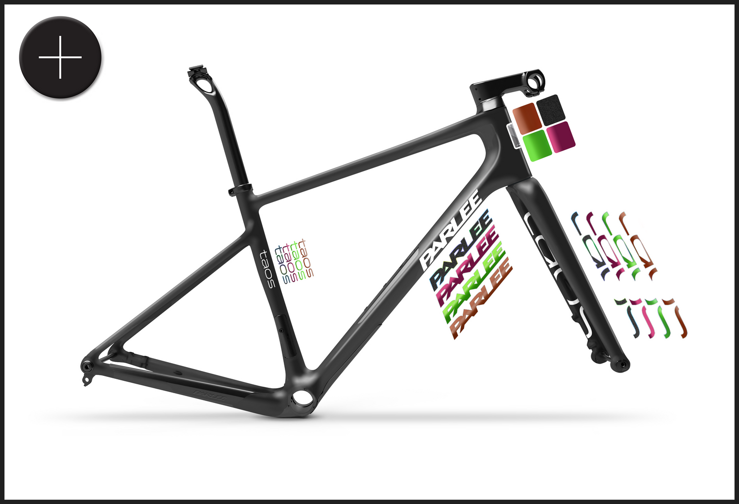
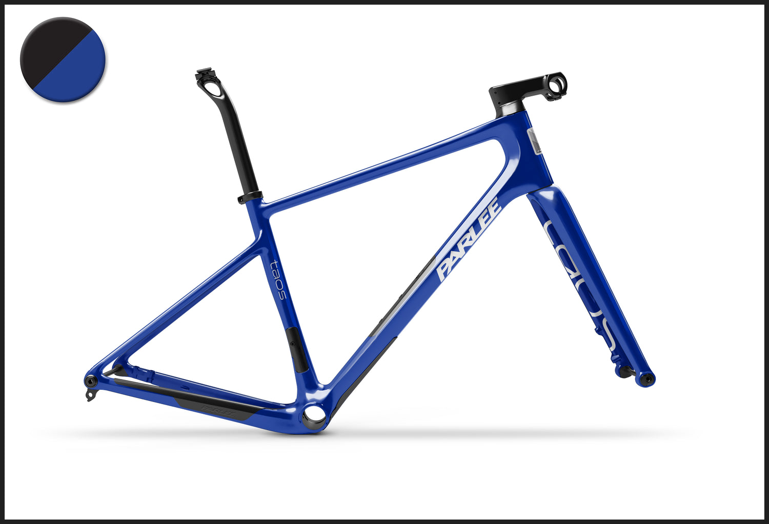
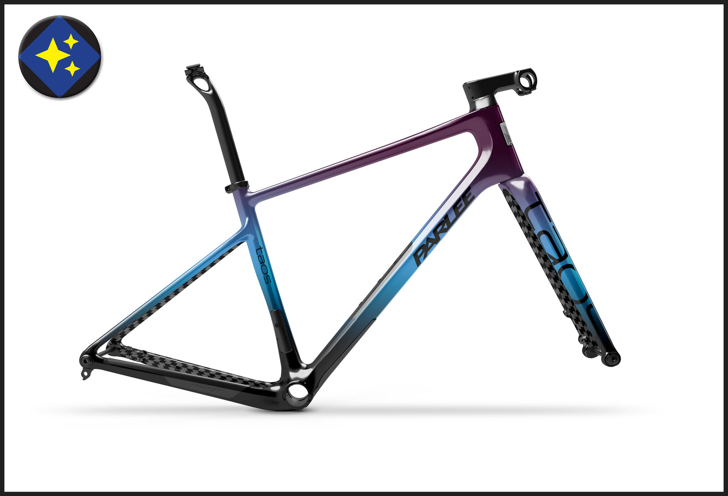
The Parlee Paint Lab is recognized as one of the premier paint programs in the world. We offer pre-designed paint schemes to make decision making easy, or if you have the ultimate dream in mind, go full custom and see your wildest dreams come to life. Whether it be mild or wild, we do it all.
Head Paint Artist
Production and Paint Manager
Custom Paint Designer
Parlee Paint Lab
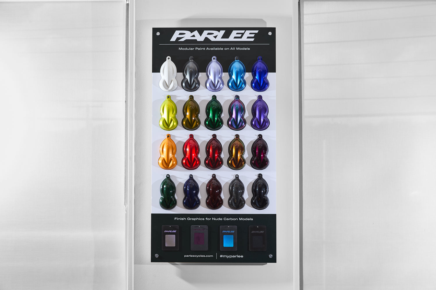
The Parlee Paint Lab offers a wide palette of 20 brilliant paint colors. Whether you prefer a bold, eye-catching hue or a subtle, sophisticated shade, the Parlee Paint Lab enables you to express your unique style and personality. All colors are available in matte or gloss.
A solid white hue. This shade looks so rich it’s like it was poured on, not painted. Best suited as a logo or accent color.
A dark gray with metallic effect. Timeless like a grey pinstripe suit that oozes class.
Takes you on a trip to the south of France, no passport required. This color is inspired by the beautiful Lavender fields of Provence.
It's as if we bottled up the perfect Italian getaway and somehow translated it into paint. All you have to know is that it’s a brilliant blue.
A deep blue that may or may not be inspired by a certain Italian rim brake caliper from the late 80’s.
A color choice for the bold. It’s bright metallic colors are a mix a between lime green and neon yellow. Warning, might be radioactive.
Not quite green nor is it quite gold. Trailmix sits somwhere between, and it’s metallic effect comes to life when it’s out in the sun.
Yes, you guessed it, this is our take on the classic British Racing Green that we’ve all come to know and love.
Jekyll + Hyde is as it’s name suggests, two in one. It looks green, it looks purple, sometimes it looks both. It all really depends on the angle and light.
A regal shade of purple, with a spectacular metallic finish. In our case, this color is visible to the human eye.
A punchy shade of orange for those looking to make a statement, or avoid catching scurvy.
Where passion meets speed. This is your classic red with a hit of metallic flake.
Like an aged fine wine; deep red with a feeling of elegance. Enjoy the finer things in life with this red.
Transports you to hills of Scotland, where the finest Scotch on earth is born. Depending on the angle, colors shift between gold and red.
A velvety smooth shade of purple. Kick back and put on some Prince as you choose this color.
Somewhere between a paint and a clearcoat. It’s dark in the shade, but an explosion of color in the sun. It’s the color of money, what’s not to love?
Like the cover of night, with a full moon overhead. It’s dark blue hue is subtle in shadows and transforms to life once it’s in the sun.
Perhaps this color should be named liquid temper. It’s quite dark in the shadows but bring it into the light and it’s red hot.
A clear finish for those that want to proudly highlight the carbon craftsmanship that makes their bike so special.
Inspired by the beaches of Iceland, where the silky dark sand has a metallic shimmer to it. Embrace the Nordic Island with this paint.
A solid white hue. This shade looks so rich it’s like it was poured on, not painted. Best suited as a logo or accent color.
A dark gray with metallic effect. Timeless like a grey pinstripe suit that oozes class.
Takes you on a trip to the south of France, no passport required. This color is inspired by the beautiful Lavender fields of Provence.
It's as if we bottled up the perfect Italian getaway and somehow translated it into paint. All you have to know is that it’s a brilliant blue.
A deep blue that may or may not be inspired by a certain Italian rim brake caliper from the late 80’s.
A color choice for the bold. It’s bright metallic colors are a mix a between lime green and neon yellow. Warning, might be radioactive.
Not quite green nor is it quite gold. Trailmix sits somwhere between, and it’s metallic effect comes to life when it’s out in the sun.
Yes, you guessed it, this is our take on the classic British Racing Green that we’ve all come to know and love.
Jekyll + Hyde is as it’s name suggests, two in one. It looks green, it looks purple, sometimes it looks both. It all really depends on the angle and light.
A regal shade of purple, with a spectacular metallic finish. In our case, this color is visible to the human eye.
A punchy shade of orange for those looking to make a statement, or avoid catching scurvy.
Where passion meets speed. This is your classic red with a hit of metallic flake.
Like an aged fine wine; deep red with a feeling of elegance. Enjoy the finer things in life with this red.
Transports you to hills of Scotland, where the finest Scotch on earth is born. Depending on the angle, colors shift between gold and red.
A velvety smooth shade of purple. Kick back and put on some Prince as you choose this color.
Somewhere between a paint and a clearcoat. It’s dark in the shade, but an explosion of color in the sun. It’s the color of money, what’s not to love?
Like the cover of night, with a full moon overhead. It’s dark blue hue is subtle in shadows and transforms to life once it’s in the sun.
Perhaps this color should be named liquid temper. It’s quite dark in the shadows but bring it into the light and it’s red hot.
A clear finish for those that want to proudly highlight the carbon craftsmanship that makes their bike so special.
Inspired by the beaches of Iceland, where the silky dark sand has a metallic shimmer to it. Embrace the Nordic Island with this paint.
Swipe to explore →
Hover or tab into the images to pause the loop.
PACKAGE
PACKAGE
PACKAGE
Interested in customizing a Parlee of your own? Reach out today or find your nearest authorized Parlee dealer to get started on your dream bike.
Connect with the wider Parlee community, read stories from the saddle and keep pace with all the news and updates from the road.